Production notes
A product launch video storyboard, from promise to final frame
Plan a product launch video with a worked 30-second storyboard, an editable shot-list template and a review checklist for real product UI, timing and sound.
By Refs · · 5 min read
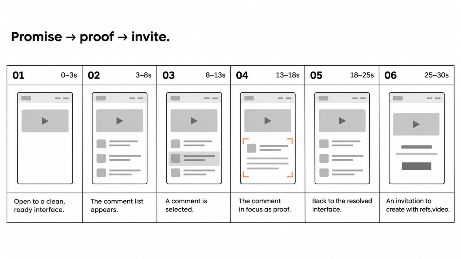
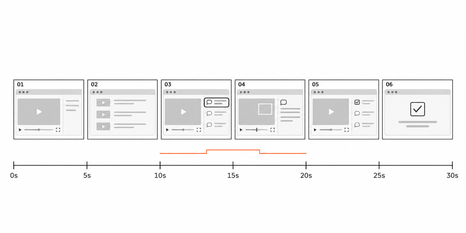
A product launch video storyboard connects the message to the picture. Each beat should say what the viewer learns, what they see and how long it stays on screen. You should be able to review the story before anyone builds a transition.
Below is an illustrative 30-second storyboard for a feedback tool. It is a worked template, not a measured breakdown of an existing film or a claim about the best-performing runtime.
Decide what the film needs to prove
Imagine a tool that keeps feedback attached to the exact screen being reviewed. Its promise is “Know which change each comment belongs to.” Its proof is a comment opening directly on the relevant UI, followed by a visible resolution.
That proof determines the middle of the film. An animated logo cannot demonstrate it. A fast montage of dashboards may hide it. Record the interaction in the real product, with safe sample data, and make the action legible at the final viewing size.
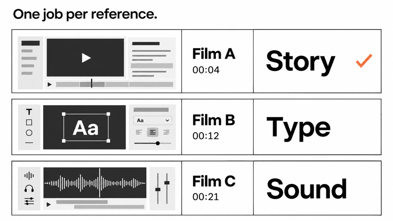
Before storyboarding, choose a primary reference. Use it to guide the sequence and pacing while keeping your own product's proof at the centre.
A worked 30-second storyboard
| Time | What the viewer learns | Picture and action | Sound direction |
|---|---|---|---|
| 0–3 s | Feedback loses its context | One screen, three disconnected comments; headline: “Which change?” | A short, restrained opening cue |
| 3–7 s | There is a clearer way | The real product opens on one selected screen | Music begins, leaving space for reading |
| 7–13 s | A comment points to the exact thing | Select a comment; its target highlights in the UI | One cue on selection |
| 13–20 s | The team can act on it | Show the change, then resolve the comment | Let the action carry the rhythm |
| 20–25 s | The workflow has a visible result | Hold the updated screen and resolved state | Reduce the musical density |
| 25–30 s | What to do next | Product name, URL and one invitation | A clean musical resolution |
The time ranges are starting allocations. If the interaction needs eight seconds to be understood, give it eight seconds and shorten something else. Read the headline aloud and watch the product action at normal speed before deciding the timing is finished.
Make the shot list executable
A storyboard describes the audience's experience. The shot list adds the material needed to build it. For each row, name the source file, crop, text, movement, entry frame and exit frame.
For the 7–13 second beat above, the implementation note might be: “Use the captured comment-selection interaction. Keep the full comment and target visible. Start with the cursor already near the comment. Hold the highlight long enough to connect the two.”
That instruction is more useful than “smooth UI animation.” It also gives the editor a clear acceptance check: can someone unfamiliar with the product see which comment belongs to which object?
Use this blank storyboard template
Beat number and time range:
What the viewer must understand:
Visible product action or image:
Exact on-screen copy:
Asset file and permission/source:
Framing and movement:
Voice, music or sound cue:
Transition into the next beat:
Review check: what must be readable or recognisable?
Keep one main message per beat. If a row includes three benefits, two screen changes and a paragraph of copy, split it. The purpose of the template is to expose competing demands on the viewer's attention before they become expensive edits.
Separate structure from decoration
Review the storyboard as a sequence of still frames with the proposed text underneath. A rough product capture is enough for this pass. Ask whether the problem, action and result connect without a voice explaining missing steps.
Then add movement for a reason. A camera push can direct attention to a small control. A match cut can connect the problem to its solution. An unmotivated zoom may make the same action harder to understand.
Choose a consistent type scale, spacing system and motion treatment for the whole film. Supporting references can solve specific transitions, but they should not change the visual language every few seconds.
Plan audio before the final render
Write down which beats need voice and which can stand on their own. If the product action is self-explanatory, a moment without narration may give the viewer time to process it. If voice is essential, record a timing draft before locking shot durations.
Mark sounds against actions instead of filling every gap. A click or impact earns its place when it clarifies a selection, reveal or change of state. Leave room around important words and use music you have the right to publish.
Review in three passes
- Comprehension: watch the sequence without sound. Can a new viewer explain the product's promise and the demonstrated action?
- Timing: play it at normal speed. Can the viewer read each title and see the result before the next cut?
- Delivery: inspect the exported file at the actual aspect ratio and phone size. Check text, cursor visibility, audio ending and the final URL.
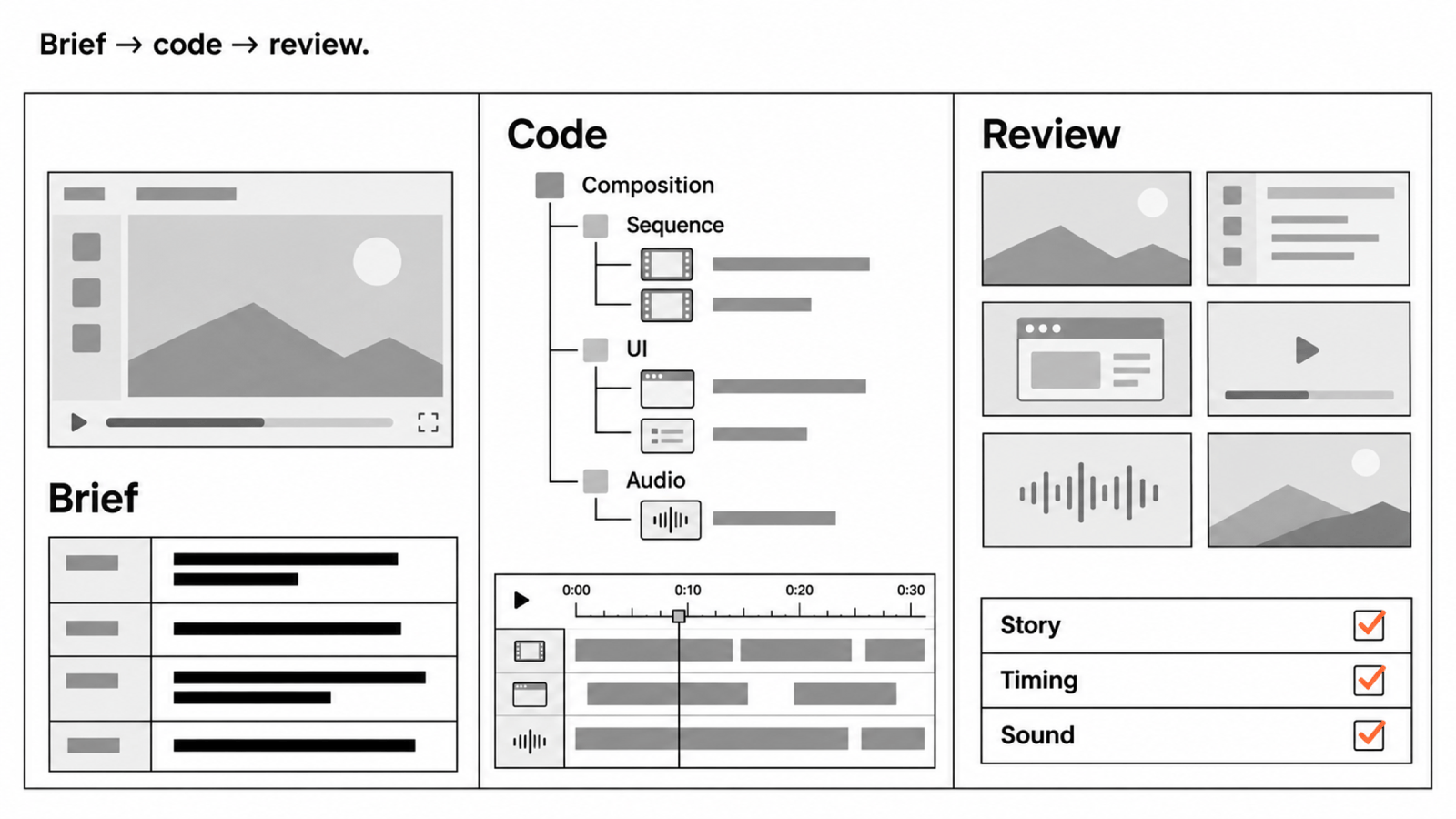
A contact sheet helps with composition and continuity; full playback is still necessary to judge rhythm and sound. If you are building in code, use the Remotion reference-to-render workflow to carry this storyboard into production.
How long should the storyboard be?
Choose the length from the proof you need to show and where the film will appear. A short teaser can leave questions open; a product demo needs time to show an action and its result. There is no universal duration that makes both jobs work.
For measured context, Refs publishes a launch-video pacing study with its sample and method. For visual research, browse UI animation references and compare how different films spend time on the same kind of interaction.